

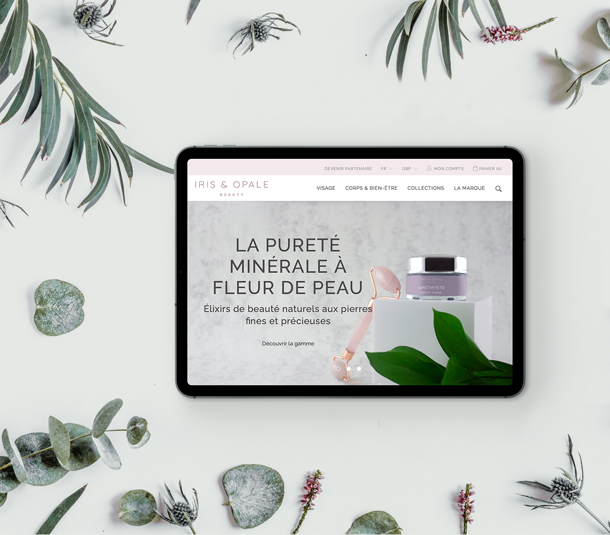
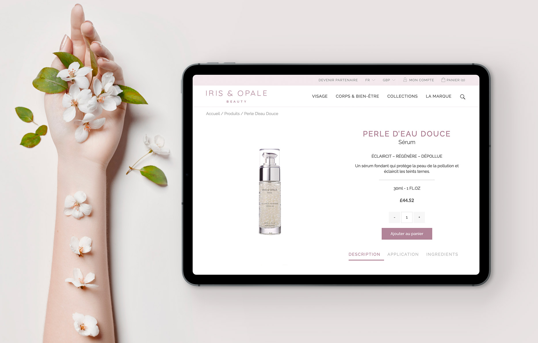
The small french organic cosmetic brand is now relaunching with a new name, a fresh new look and packagings supported by a new e-commerce website. Their products are made with natural ingredients and gemstones such as lapis lazuli, amethyst and malachite.
Having reached a small but steady customer base, they now want to expand to a wider international market.
The outcome
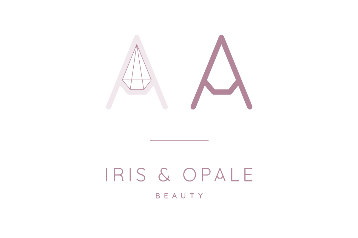
The brand overhaul started with researching the competition to understand the natural and eco-friendly cosmetic market. The name Iris & Opale was found combining the adjective ‘iridescent’ and the stone name ‘opale’. The aim was to evoke the gemstones without using obvious names and to translate femininity.
The logo was created alongside the brand guidelines to help maintain consistency through various view points. The artistique direction of the packagings was developed using abstract close up of gemstones. It creates a bold but elegant vessel for the products.
An e-commerce website was created using WordPress, presenting the whole range of products and the brand philosophy and ethos.
don't just take my work for it...
“We are over the moon with our new identity. It gives our products great gravitas. Scarabé has proven the perfect partner in this exciting journey. ”
Aurore Ghiringhelli, Iris & Opale founder
contact us