

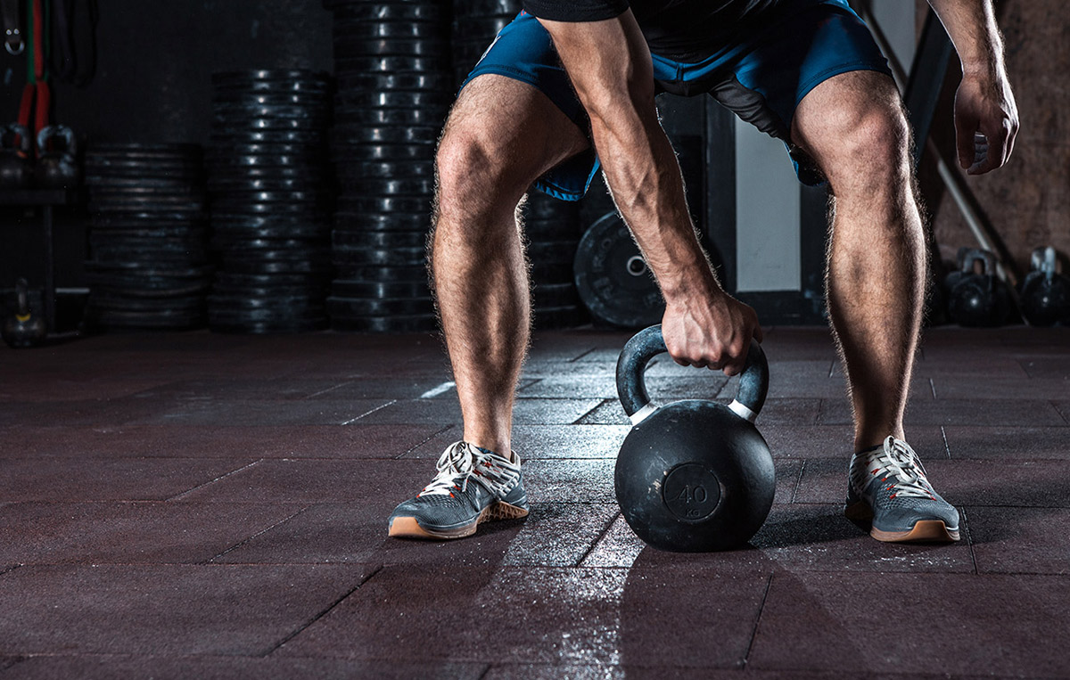
Blast is a new concept of full body workouts that combine strength, cardio, core and reaction (speed/agility). Their new boutique studio was launched in 2019. The owner Matt, asked me to create a logo and a website to attract customers.
The outcome
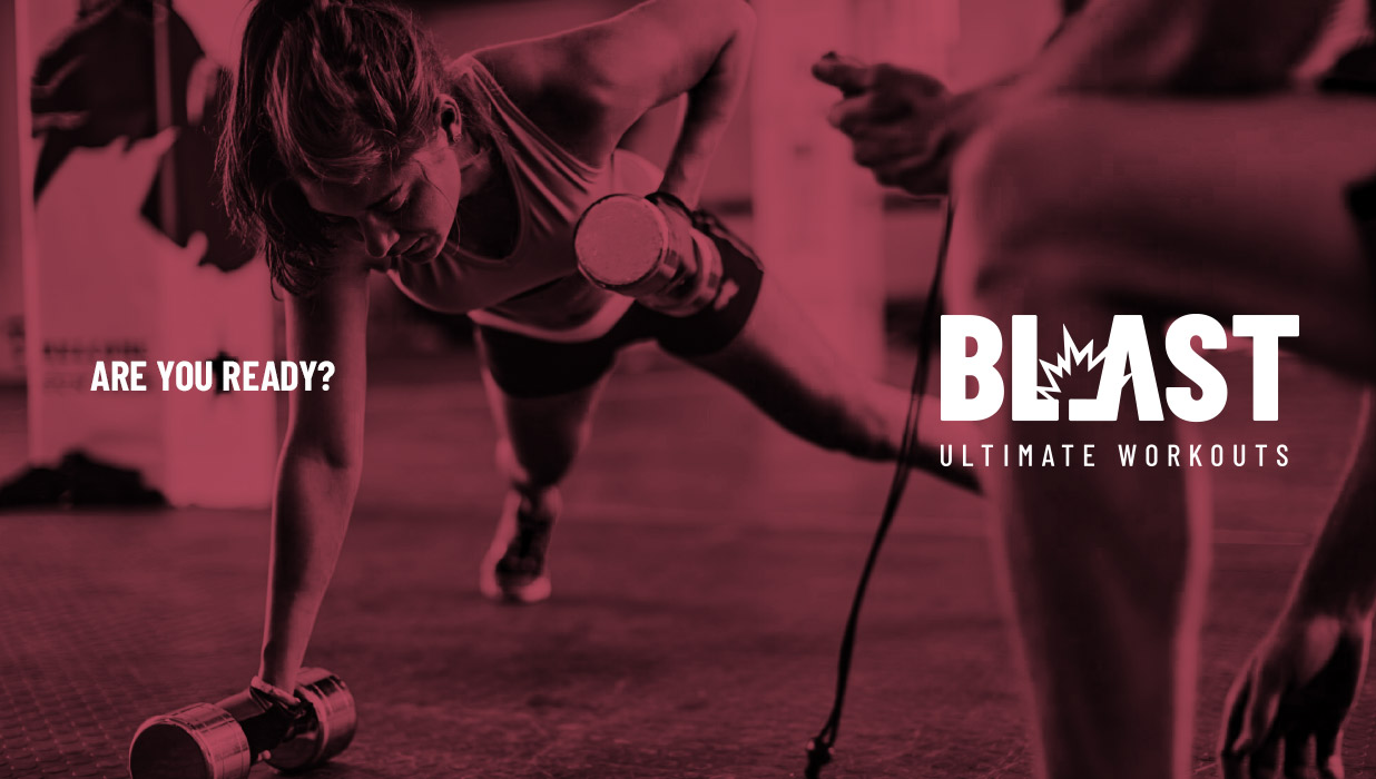
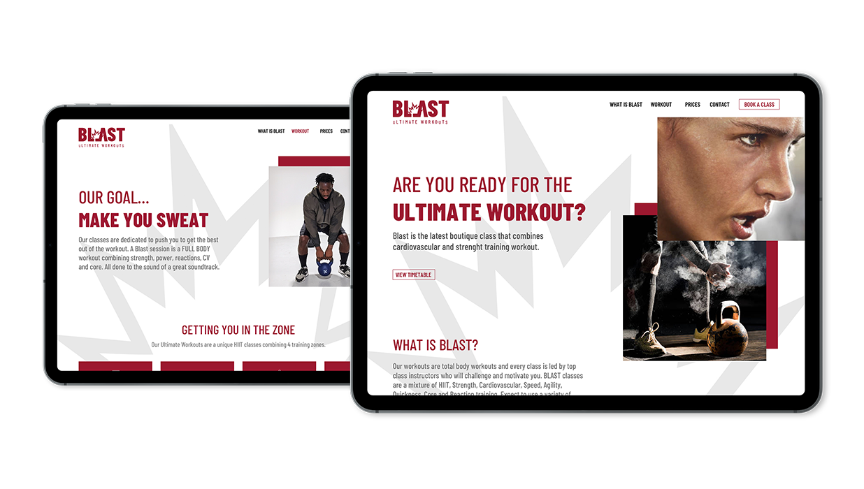
For the logo, the owner’s brief was a logo that could act as a mark, something with a ‘street’ feel and that could be recognisable. The visual created is a blast symbol intertwined with the letters L and A. For the colour choice, red and grey, it was all about being different and stay away from blue and orange that are commonly used in the fitness industry. The website carries the blast symbol through its pages, the imagery is bold and strong.
don't just take my work for it...
“Our new logo and brand has proved popular amongst members. The website has been a great online presence. Thanks Vanessa!”
Matt Hirst, Blast Fit Owner
contact us