


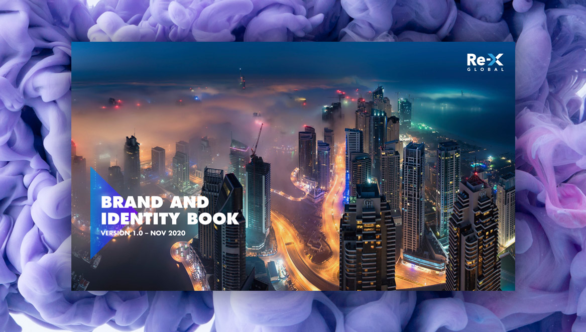
Re-X is the new name for one of the market leading provider of recall and remediation solutions. Their brief was to refine the logo and create a branding to reflect their values and business proposition. From there, a whole suite of marketing and corporate assets would need to be created to carry the new branding.

The outcome
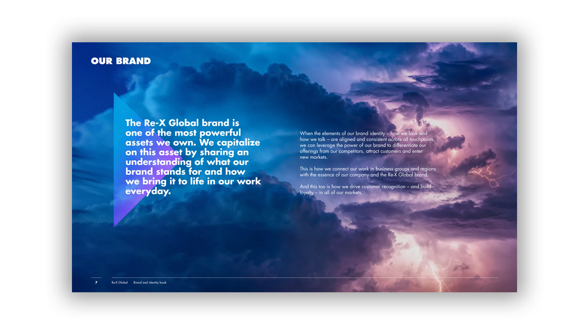
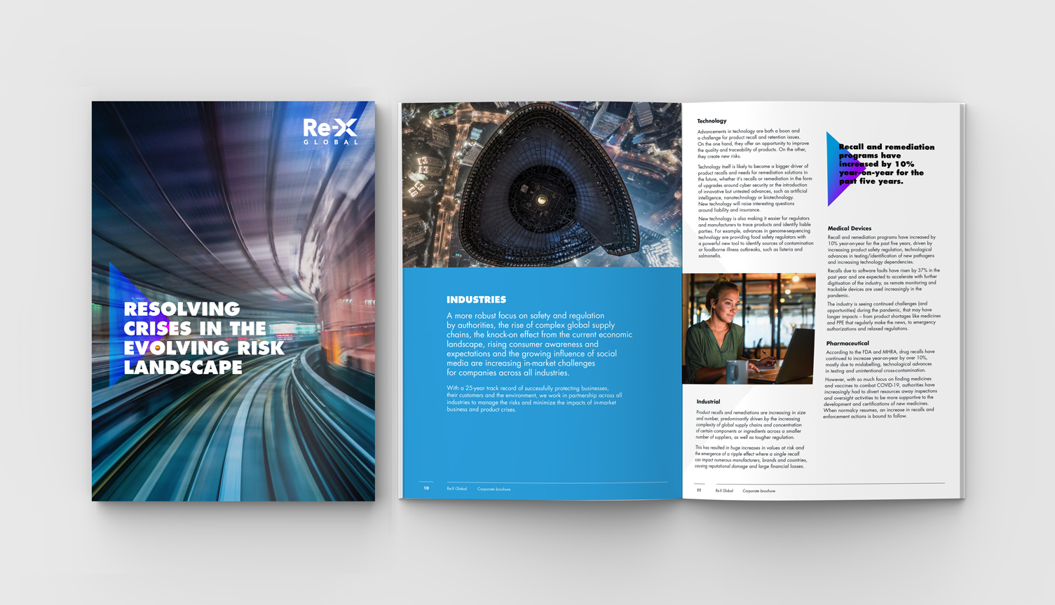
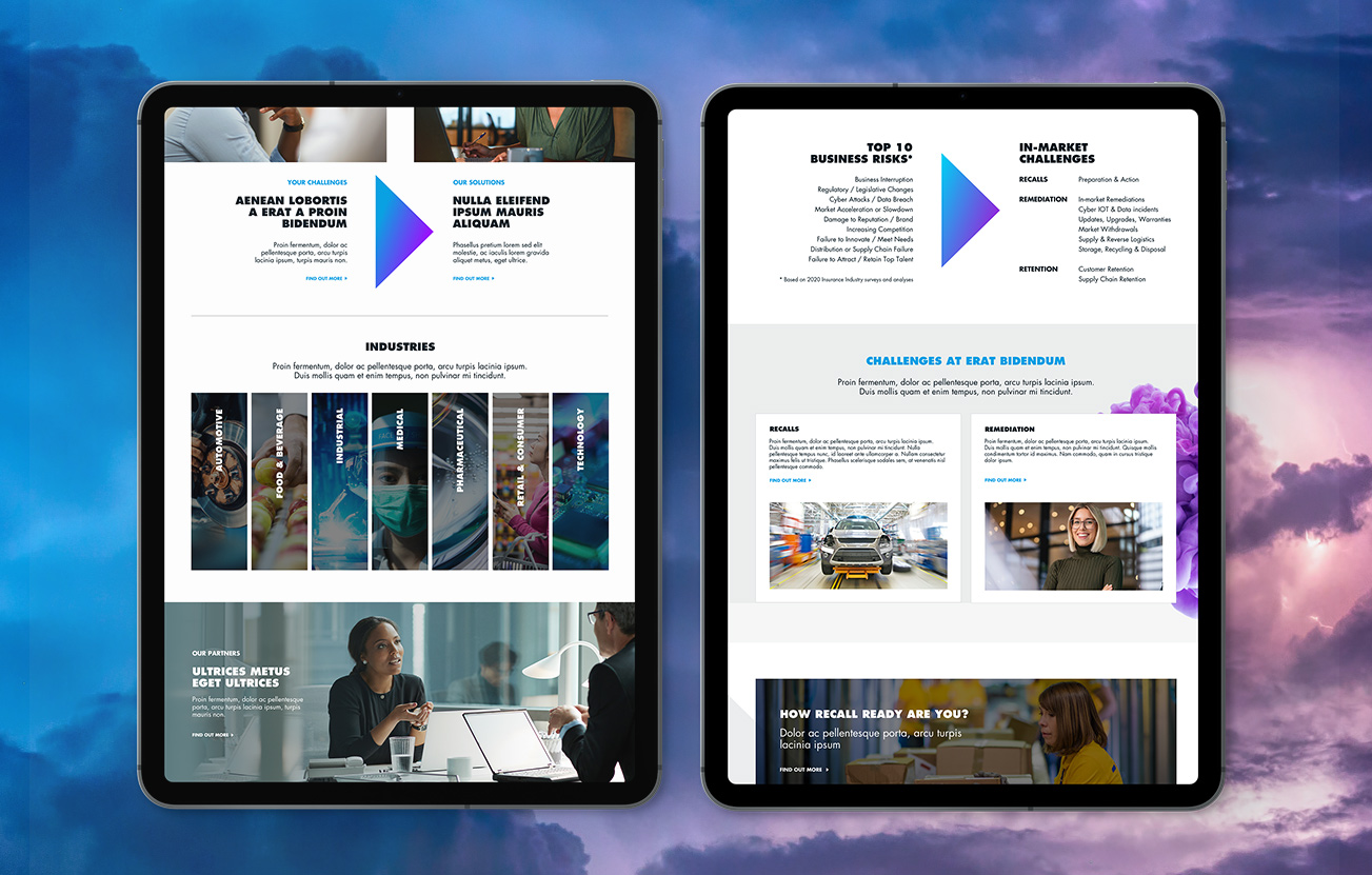
The client had a clear idea of the visual territory they wanted the brand to explore – bold and vibrant to project ambition and capabilities beyond conventional resources. The arrow from the logo, called ‘Trigon’, became the centre of the brand visual language and used across all mediums. Extensive brand guidelines were created to clearly explain this new brand positioning, everything from the brand strategy, name, tone of voice and the visual identity was covered. From this branding phase followed a whole suite of marketing support: a website, corporate literature, sales sheet and a video. The new brand was very well received.
don't just take my work for it...
“Our new logo and brand has proved popular amongst members. The website has been a great online presence. Thanks Vanessa!”
Matt Hirst, Blast Fit Owner
contact us